To continue my love of calligraphy in movies, I bring you
The Age of Innocence. This 1993 film is Martin Scorsese's directorial adaptation of Edith Wharton's Pulitzer Prize winning novel of the same title.
The handwritten word is almost a character itself in the film which was done by calligrapher Bernard Maisner. The opening credits were designed by Saul and Elaine Bass. Saul Bass is best know for his title sequences for movies like
Psycho and
West Side Story. In this title sequence we see line after line of copperplate calligraphy creating a texture over a blooming flower.

The set director and props master went to great detail to include lavish details that would only be seen for seconds. A perfect example is the next still of Mrs. Mingott selecting flatware for dinner to welcome Countess Ellen Olenska.

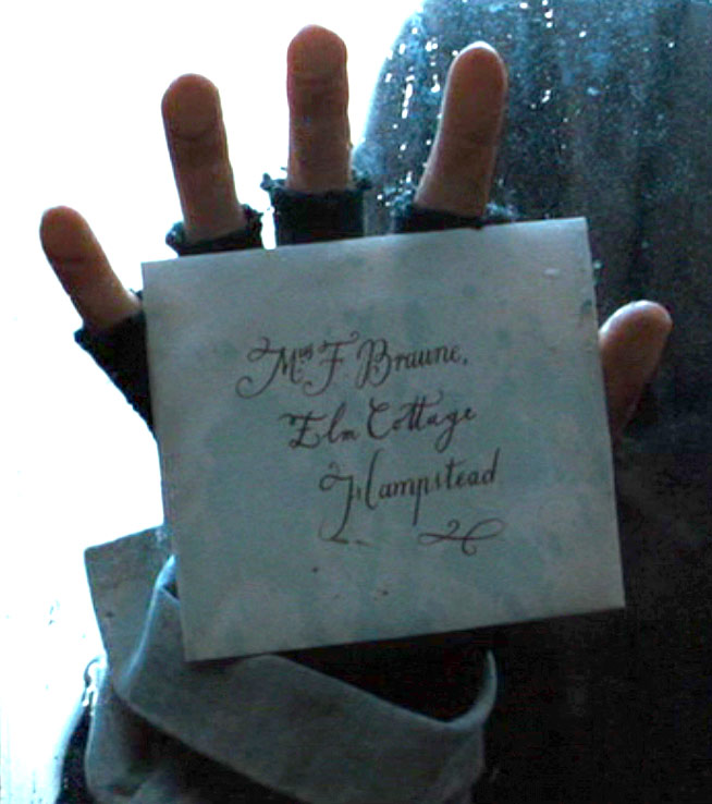
The invitation is sent and presented. Of course there is no address on the envelope below, as it would have been delivered by hand and most likely delivered with an outer envelope, much like a wedding invitation. The outer envelope was removed before it was received by the lady or gentleman of the house. This was done so the recipient would receive his or her formal invitation without dirt or fingerprints from the delivery man.

Next is the invitation, beautifully written on stationery known as formals. If you look carefully, you can tell that the page would open like a card, but the invitation is written only on the front of the folded paper. One would also use a formal to send a letter or acceptance or regret to the event.

Sadly, everyone sends regrets. Below is a still from the montage.

Later in the film, Newland Archer sends a bouquet of yellow roses to Countess Ellen Olenska. He includes his calling card in an envelope. Note the silver calling card case.

This is an absolutely beautiful movie, not just for the calligraphy but for the story, costumes, sets, and even food. If you have a love for costume dramas, than this will most likely be somewhere toward the top of your list.




 Today I am featuring the work of The Yellow Owl Workshop -- an innovative group I met from the National Stationery Show. I had a very nice conversation with Evan, and he showed me around the booth. Much of their work was done with silkscreen, which makes for beautiful, flat colors. I tried silk screening in college, and though I love it, I must say I find it a tedious process when working with more than one color. I admire anyone who can get good registration with this method of printing.
 There were also some innovative works made with blind embossing. I am surprised I have not seen more of this technique used with other vendors, but perhaps The Yellow Owl Workshop is starting the trend. I really like their do-it-yourself greeting with the LCD card. Nice work!
 I have spent last two days at the National Stationery Show, which was a positively overwhelming event. It seemed the true die-hards were there this year, and I met a lot of great people, many who started off with a printing press and a dream. I skipped most of the big corporate booths, and focused my time on hob-knobbing with those in the cottage industries. Everyone I spoke to really seemed to love what he or she was doing. Also, I made some wonderful connections for calligraphy -- so many people had very nice things to say about the booklets I handed out to everyone.
 I had an excellent conversation with Trish Kinsella, owner of the Dauphine Press. I had seen her work featured in something recently (I'm guessing it was a Martha Stewart bridal magazine); it is no secret that she is to stationery as Mercedes is to automobiles. If one were able to pick up a sample of her work, you will find she does very delicate and lovely letterpress on very thick stock. She was complimentary of my calligraphy and was very encouraging. I hope to stay in touch with her, as she is highly respected for what she does, and was such a kind person, as well. Thanks Trish!

