Friday, April 16, 2010

Who the Devil Cares What a Woman Wears?

How does one make a musical around clothing? How does one make clothes the centerpiece of the show, especially when you have someone like Katherine Hepburn in the starting role? Here's a clip from the 1970 Broadway musical Coco. This video includes great costumes (some of them, I'm not sure which, are Chanel originals) and an innovative use of sets and choreography.


By the way, what a great poster.


Tuesday, April 06, 2010

Lady GaGa Week—Schiaparelli Influence, Part II

Yesterday's posting observed Lady GaGa's Schiaparelli influence with her surrealist-inspired telephone hat. Showing no fear regarding bizarre millinery, Lady GaGa brought glamor by way of a crustacean with her silver lobster hat shown in the following photo.
Many designers have their iconic pieces: Diane Von Furstenberg gave us the wrap dress, Coco Chanel gave us the little black dress, and Elsa Schiaparelli gave us the lobster dress. It was beautifully designed with a waistband in her signature "shocking pink" and a large lobster gracing the front of the skirt.
This was another collaboration made with artist Salvador Dali, also known for his Lobster Telephone (also shown). The dress was worn by Wallis Simpson in a Cecil Beaton photo shoot, and has found its way into many fashion history books.
What made Schiaparelli's dress so opulent is the same sensibility that works for Lady GaGa: take a creepy creature from the deep that has been around for millions of years, and make it glamorous. Schiaparelli's lobster is very delicate, like something you would find in a Japanese sumi-e (or ink and wash) painting, where Lady GaGa's lobster sparkles like a Judith Leiber clutch. Does anyone remember in Sex and the City where Carrie got the bejeweled duck purse from Mr. Big to carry to the boring, WASPy party? Remember how they thought that these bags were carried by uptight, "more mature" women? Perhaps Lady GaGa is taking the trend of wearing cute and friendly animals and turning it on its head by substituting something that is not at all kosher and has claws that aren't afraid to hurt you.

Monday, April 05, 2010

Lady GaGa Week—Schiaparelli Influence, Part I

Because of the positive response I had from last week's postings, I have decided to dedicate an entire week to Lady GaGa and fashion influences. I thought I would begin with one of her most current conversation pieces, the telephone hat. If you haven't seen the video, I suggest you watch it; it's not just a music video, but a mini-movie in the style of Kill Bill (click here for the link). As you can see in the images below, whether made or hair or completely deconstructed, the telephone hat has taken on many forms.


Lady GaGa's headgear made me think of Elsa Schiaparelli's famous shoe hat—a collaboration with the surrealist artist Salvador Dali. For those of you not familiar with Schiaparelli, she was one of Coco Chanel's greatest rivals and known for her designs with surrealist influences, along with her bold use of color. Wikipedia listed the shoe hat as one of her major contributions to the fashion world:

In 1933 Dali was photographed by his wife Gala Dali with one of her slippers balanced on his head. In 1937 he sketched designs for a shoe hat for Schiaparelli, which she featured in her Fall-Winter 1937-38 collection. The hat, shaped like a woman's high heeled shoe, had the heel standing straight up and the toe tilted over the wearer's forehead. This hat was worn by Gala Dali, Schiaparelli herself, and by the Franco-American editor of the French Harper's Bazaar, heiress Daisy Fellowes, who was one of Schiaparelli's best clients.

Does the shoe hat look familiar, but you just can't put your finger on where you remember seeing it? For those of you film buffs, you may remember seeing Katherine Helmond ("Mona" from Who's the Boss?) wearing it in Terry Gilliam's Brazil.

Friday, April 02, 2010

The Banding Continues


I mentioned it before, and I'm seeing it again. Banding is everywhere, and it's such a nice detail. Here's where I spotted some great pieces in red and black (two colors I love) at the SoHo DKNY.

Thursday, April 01, 2010

Wednesday, March 31, 2010

Lady Gaga, Paparazzi: from George Michael to the Met

Lady Gaga is everywhere, and she's the cover story for this week's New York Magazine. I was watching the music video "Paparazzi" and couldn't help but notice that one of the outfits (shown below) looked a lot like one I remember from another music video made almost two decades ago.


Does anyone remember the runway show in George Michael's "Too Funky" music video? I believe that it's none other than one of the fantastic creations by designer Thierry Mugler.


Because my screen shots were so low quality, I found a better photo. I believe this was the same piece that was featured at the Metropolitan Museum of Art's show Superheroes: Fashion and Fantasy.

Tuesday, March 30, 2010

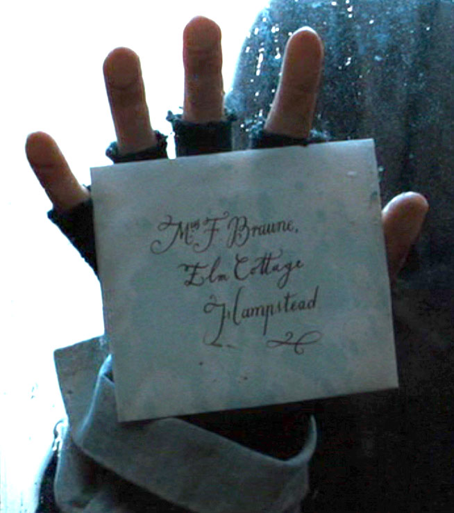
The Portrait of a Lady—Glimpses of the Victorian Hand

Anyone who knows me well knows that I cannot speak on the subject of film without bringing up one of my favorites, Jane Campion's 1996 masterpiece, The Portrait of a Lady. The film was made on the heels of her 1993 success The Piano, but did not reach the same acclaim. In fact, the DVD is currently out of print. However, Jane Campion's love for the costume drama led her to directing Bright Star, which I mentioned in the previous entry.

The film's opening credits fade in and out over what one can guess are contemporary women about the same age as our heroine, Isabel Archer. The film's title is written on the hand, ever so delicately. Perhaps it was written by the same person who not only did all of the calligraphy for this movie, but for Bright Star, as well.


The written word is scarce in this film, but not worth ignoring. As Isabel packs her bags, she pulls slips of paper that are tucked into a crevice of her wardrobe door. Perhaps these are her vocabulary words of the day? Whatever they may be, the words foreshadow the tone of the film.


Notice the use of all uppercase letters—this is not something very common of the period, and does not make for the best readability. As bizarre as it may seem, it is unique and interesting.


The last small bit of calligraphy included is for Isabel's world travel sequence. This sequence was done in the style of an early film, and the writing is reminiscent of captions one may have written in a photograph album from that period.

Monday, March 29, 2010

Bright Star—Calligraphy in Georgian England

The next film chosen for its beautiful calligraphy is the 2009 Jane Campion film Bright Star, a love story involving the most famous Romantic poet, John Keats. While watching this movie, I noticed that leading lady Abbie Cornish bears a striking resemblance to Nicole Kidman, the leading lady of Jane Campion's 1996 period piece The Portrait of a Lady.


The film takes place in during the Georgian Era, and includes simple, yet beautiful Regency interiors and shots of the English countryside. The correspondences throughout the movie are letters folded to make their own envelopes. On this particular image, one can see a stamp that looks like an imperial crown.


If one is quick, he or she can catch a glimpse of the addresses. What makes them so beautiful to me is that they are each hand-written and flourished, but they are not so perfect that we find it hard to believe they were written for daily correspondence.


Some envelopes are more simple than others.


One of the major turning points of this film includes a valentine. It even includes hand-drawn details and a small amount of color.


Below is my favorite screen capture from the film. In this shot, one can see the letter through the paper. Though out of focus, a stamp on the letter to the far right is visible, just like one of the letters shown previously.

Thursday, March 25, 2010

The Age of Innocence—Calligraphic Opulence

To continue my love of calligraphy in movies, I bring you The Age of Innocence. This 1993 film is Martin Scorsese's directorial adaptation of Edith Wharton's Pulitzer Prize winning novel of the same title.

The handwritten word is almost a character itself in the film which was done by calligrapher Bernard Maisner. The opening credits were designed by Saul and Elaine Bass. Saul Bass is best know for his title sequences for movies like Psycho and West Side Story. In this title sequence we see line after line of copperplate calligraphy creating a texture over a blooming flower.


The set director and props master went to great detail to include lavish details that would only be seen for seconds. A perfect example is the next still of Mrs. Mingott selecting flatware for dinner to welcome Countess Ellen Olenska.


The invitation is sent and presented. Of course there is no address on the envelope below, as it would have been delivered by hand and most likely delivered with an outer envelope, much like a wedding invitation. The outer envelope was removed before it was received by the lady or gentleman of the house. This was done so the recipient would receive his or her formal invitation without dirt or fingerprints from the delivery man.


Next is the invitation, beautifully written on stationery known as formals. If you look carefully, you can tell that the page would open like a card, but the invitation is written only on the front of the folded paper. One would also use a formal to send a letter or acceptance or regret to the event.


Sadly, everyone sends regrets. Below is a still from the montage.


Later in the film, Newland Archer sends a bouquet of yellow roses to Countess Ellen Olenska. He includes his calling card in an envelope. Note the silver calling card case.


This is an absolutely beautiful movie, not just for the calligraphy but for the story, costumes, sets, and even food. If you have a love for costume dramas, than this will most likely be somewhere toward the top of your list.

Wednesday, March 24, 2010

Gone with the Wind—Letters of the Civil War

One of my favorite movies of all time is the 1939 classic Gone with the Wind. Within the movie, two handwritten letters are shown. The first is the letter to Scarlett to inform her of her first husband Charles's death. Lovers of trivia, note the letter is signed by Wade Hampton, a name that sounds like Wade Hamilton, the son Scarlett had with Charles in the book, but never mentioned in the movie.


It's beautifully written, and it reminds me of the logo that would appear twenty years later for The Fantasticks designed by Tom Jones (the one who wrote for Broadway, not the one who sang "What's New Pussycat?"). I have read in The Fantasticks: The Complete Illustrated Text Plus the Official Fantasticks Scrapbook and History of the Musical that it was taken from his everyday handwriting.


The next letter was to Melaine and has the lovely copperplate, otherwise known as engrosser's script, that was more popular in the period.


Below, I have added a photograph of an actual letter from The Civil War.


The letters in the movie are a little more stylized than what you would have actually seen during the time period, but it's a movie, and I'm sure they were aiming for legibility. Nevertheless, they move the story along with the decorum and elegance associated with the antebellum South.

Tuesday, March 23, 2010

41 minutes and 59 seconds of jazz!

I am one of those rare New Yorkers who actually knows his neighbors, two of which happen to be the talented musicians Perry Smith and Kathleen Smith. We are good friends, and invite each other over for dinner, cocktails, or cleaning out the fridge leftovers. I never thought that when I moved to New York I would live in such a great building of artists and musicians, just hanging out and having fun. I thought that only happened in musicals from the 1950s.

This last weekend, when the weather was so nice, we met on the roof for cocktails and appetizers. While discussing music, Perry mentioned that he had played with one of my favorite jazz vocalists, Nancy Wilson. He was kind enough to lend me the following album:


For those of you who know me, I enjoy a gem from the past just as much as I enjoy spotting the latest trend. This album was recorded in 1961, and thanks to the magical world of digital remastering, Nancy Wilson and Cannonball Adderley sound crisp and clear. While I don't think it qualifies as cool jazz, it's smoother than be-pop, and perfect for entertaining guests or for curling up on the couch with a good book.

My favorites on the album include a jazzy version "Happy Talk" from South Pacific as well as "Sleepin' Bee" from House of Flowers for the perky tunes. For a slower pace, try "The Masquerade is Over", the kind of jazz ballad that made me fall in love with Nancy Wilson in the first place.

I am guessing that in its original release, the first side included all of the songs with vocals, while side two was reserved for all of the instrumental songs. While I am a fan of both, I suggest hitting the shuffle button to get an even mix of the two.

If you are too intimidated to buy wine for a host or hostess gift, I would suggest a copy of this album. Much like the album Getz/Gilberto this one can be plucked from a music vault and enjoyed by audiences just as much today as it was after its first vinyl pressing.

Monday, March 22, 2010

Umbrella Etiquette


I waited for a rainy day to write about this subject. Wandering the streets through the everyday miasma becomes even more complicated when it rains. You're trying to dodge people and puddles at the same time, only to find that what serves as the most threatening obstacle is actually the umbrella in front of you. Perhaps the people wielding these long, pointy objects don't know exactly what they are doing, but be the better person and follow these simple rules of umbrella etiquette.


Opening an umbrella
While the the first rule of thumb seems obvious, you will probably find that it is not to some: make sure you are far enough away from others so you will not hit someone with it. Sadly, fear of actually getting wet or sheer self-absorption prevents this from happening. Also, note your location. If you are trying to do this while standing in the doorway of a building, you may be blocking the entrance for someone exiting or worse, someone soaked who is trying to get out of the rain. The same thing goes for subway entrances and exits. These are high-traffic areas, and chances are good that you will block the path and hit someone. The solution is simple: look to see if the area is clear, and open your umbrella.

Walking with an open umbrella
Thankfully, most people how to do this properly; just remember to keep the tip of the umbrella pointed toward the sky, as illustrated in this entry's image. Some ladies (and effeminate gentlemen) like to rest the pole of the umbrella on their shoulder, creating what they must assume is a "charming" posture, not unlike images of Victorian ladies with parasols. I have news for you—it looks silly and dangerous. If the person is petite, then the end of the umbrella is at eye level to someone taller. Should one stop suddenly, both parties will be very sorry. If you like the look of the umbrella on the shoulder, please save it for boat rides in the park.

Walking with an unopened umbrella
This is the most dangerous situation, so please pay close attention. When walking with a closed umbrella always keep the pointed end toward the floor. I cannot tell you how many dapper businessmen and chic businesswomen do not follow this. Yes, it feels elegant holding it under your arm like a riding crop at a foxhunt, but it's downright foolish. Unknowingly, one could hit a small child in the face with the point—how elegant are going to look covered in blood with a screaming child and an angry parent? I'm thinking lawsuit. Follow the same rules you learned for holding scissors and knives—always keep the pointed end pointing toward the floor.

So, what should one do if confronted with someone who is holding an umbrella incorrectly? The best suggestion is to stay a safe distance away from him or her. However, if you're caught in a mass exodus, this may not be so simple. What I'm about to suggest may not be the most polite thing to do, but I always believe safety trumps etiquette. I (very gently) push the point of the offender's umbrella toward the floor. In a crowd, it's hard for people to hear, and no one wants a lecture on safety, so your best bet is to brush it out of the way. Every time I have done this, the person understands immediately what he or she is doing and corrects the situation. However, if you should be confronted, tell him or her it was a hazard and you could have been hurt.

With the knowledge, please, go forth and make the world a safer place on a rainy day, and hope that sunshine is just around the corner.

Thursday, March 11, 2010

Full Glitz

How can anyone pass this window without stopping to look? Burberry (this window is on 57th Street) has taken the trenchcoat and turned it into evening wear. Does this remind anyone of the black evening coat Blair wore to the French Ambassador's ball in the most recent episode of Gossip Girl? Metallic neutrals are all the rage, as you may have noticed at the Oscars on Sandra Bullock, Helen Mirren, and Demi Moore, just to name a few.

Of course, how could the banding on the bag escape my notice? It's everywhere!

Wednesday, March 10, 2010

Did I not mention in a previous entry that I was seeing a good deal of banding on clothing? Well, you certainly saw it at the Oscars.

Saturday, March 06, 2010

Famille Rose

In an earlier posting, I was very interested in some bedding with a chinoiserie pattern. After thinking about it a bit, it reminded me of an ad I saw in a 1960 edition of House & Garden.


No, it's not an exact copy, but it's definitely along the same lines as that from Duxiana. Could this style have become popular in the early 1960s become popular after the success of the film adaptation of The World of Suzie Wong? Life imitates art.


Also, thanks to my dear friend, designer Dave Laughrun, helped me to identify a more specific style of chinoiserie used in the both the previous bedding post as well as this one. The style in the previous entry uses the same color palette as 'Famille noire'—a style of Chinese porcelain that places it images on a black background (though the bedding was placed the image on indigo). In this posting the bedding imitates 'Famille rose'—a style which uses much softer colors. Nevertheless, centuries later, the two styles are still very attractive.

Friday, March 05, 2010

Looking for Mr. Goodtype

I picked up a copy of Looking for Mr. Goodbar from the New York Public library, and the copy in circulation is an actual first edition of the novel, as shown.


After looking on Amazon.com, I realized there was a new edition with a much more enticing cover.


While I am a huge fan of illustration, I really think the newer version captures the concept of the book much better. First of all, when I think of the aesthetic from the 1970s, my initial reaction is to roll my eyes. Men with perms, macrame plant holders, and orange and brown plaid do not paint a pretty picture for me. However, there was work of Yves Saint Laurent, brilliant films like Network, and a font called Avant Garde.

The font was designed by font pharaoh Herb Lubalin. Its geometric simplicity allows it to be used without distraction when used in its regular set, but takes on a whole new look when using the alternative and ligature set. With the black setting the tone for the novel's gruesome ending, and the image behind the type flickering in and out like a disco ball, it does a much better job of expressing the tone than the the softly-colored sketch in a Family Circus frame.

Apparently the style of overlapping letters is still alive and well. The New York campaign for going green seems to have been inspired by this retro type treatment.

Thursday, March 04, 2010

Victorian penmanship


Tricia Foley gave me the most beautiful facsimile of an old copy book. This one-color printing is such a beautiful and elegant use of type, and a calligraphic inspiration.

Tuesday, March 02, 2010

Florals


GeoTagged, [N40.76028, E73.96563]

Taken at Duxiana

Japanese florals look very beautiful against dark backgrounds. They remind me of prints from bamboo couches from the 1980s. Dark chinoiserie is very chic.

Friday, February 26, 2010

Banding

As I pass through the East Village and flip through the pages of Vogue magazine, I can't help but notice that banding is coming back in style. I think banding reached it height in the 1980s with Madonna in the movie Who's That Girl. These are some photographs I have taken when passing Selene. It's nice to see this beautiful, Grecian style once popularized Madame Vionnet returning to mainstream fashion.