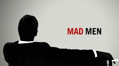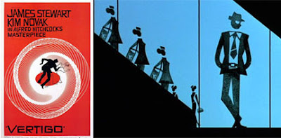
I just started watching Mad Men, and what an excellent show! It's a magnificent pastiche of mid-century New York with beautiful clothing, furniture, and flawless hair. After only three episodes, it has become my new favorite show. The open sequence is beautifully done, with silhouetted graphics that may remind you of two of my other favorites that take place around the same time period, Vertigo and Catch Me If You Can.

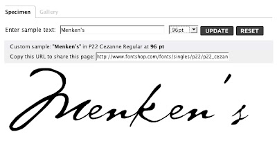
However, I did notice an anachronism in episode three of the first season. The firm is trying to drum up business for a New York department store called Menken's. Don Draper decides to drop by the building, giving us an excellent shot of the store logo etched in glass.

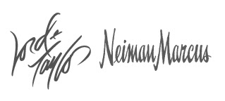
I'm sure it was inspired by handwritten logos of stores with similar price points like Lord & Taylor and Neiman Marcus.
 After a second glance, I realized that this was not a handwritten logo. Most of you know I have an aversion of fonts that mimic handwriting; this font would not be available for another thirty-six years. To be sure, I looked it up at FontShop, and sure enough, it was Cezanne.
 It's too bad they just didn't use someone's signature, as that would have been a simple solution. Oh, well, I still love the show and look forward to catching up to the current season.
first off....i am so glad that i found your blog/website!!! i absolutely adore your work and style! would love to use you for wedding invitations one day!
ReplyDeletesecond...this post is amazing!!! I am a HUGE mad men fan and read the article in Vanity Fair a few months back about how the writers are OCD about making every single aspect of the show (down to the train times Don takes from the city home) realistic and accurate. You have found the one thing that isn't! Congrats!
ok, adding you to my blog roll now....take care and i'll be back!