Thursday, November 25, 2010
Wednesday, November 24, 2010


Tuesday, November 23, 2010


Monday, November 22, 2010


Friday, November 19, 2010


Thursday, November 18, 2010


Wednesday, November 17, 2010


Tuesday, November 16, 2010


Monday, November 15, 2010


Sunday, November 14, 2010


Saturday, November 13, 2010

Tuesday, September 28, 2010
Aging Gracefully

However, a trip to the station let me know otherwise. The station is immaculate, and it's not dirt, but patina (http://en.m.wikipedia.org/wiki/Patina) that gives the station it's aged appearance. Much like the Statue of Liberty, these landmarks have aged to an intense green that L. Frank Baum may have envisioned when writing about the Emerald City in 'The Wonderful Wizard of Oz.'
Also, the station's interior has been masterfully restored. While smaller in scale, the beautiful Tiffany stained-glass ceiling rivals the beauty of Grand Central's starry fresco. Details about the restoration can be found here: http://en.m.wikipedia.org/wiki/Hoboken_Terminal
Thursday, September 02, 2010
Mad Men & Madame X
For those of you who watched last week's episode of Mad Men, The Waldorf Stories, you saw a flashback of a tryst between Cooper and Joan.

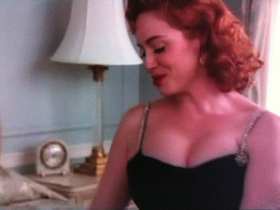
I couldn't help but notice she looked a lot like one of my favorite John Singer-Sargent paintings, Madame X.


Though the title was supposed to give the subject anonymity, it was very obvious to viewers that this was a painting of Virginie Amélie Gautreau. To add more to the scandal, the painting was hung right near a painting of Dr. Samuel Pozzi, a gentleman with whom Madame Gautreau was an extramarital affair. I think the allusion made in Mad Men was an excellent one.


I couldn't help but notice she looked a lot like one of my favorite John Singer-Sargent paintings, Madame X.

The painting was quite scandalous in its day—her strap was originally falling off of her shoulder (it was later repainted).

Though the title was supposed to give the subject anonymity, it was very obvious to viewers that this was a painting of Virginie Amélie Gautreau. To add more to the scandal, the painting was hung right near a painting of Dr. Samuel Pozzi, a gentleman with whom Madame Gautreau was an extramarital affair. I think the allusion made in Mad Men was an excellent one.
Thursday, July 22, 2010

Tuesday, June 01, 2010
Summer White: Love is Good for Anything That Ails You

Put away your corduroy, velvet, and suede so you can make room for linen and summer whites. If you want to see white made glamourous, Bob Mackie's costumes for the 1981 movie Pennies From Heaven look absolutely amazing in this tribute to music of The Great Depression. If you are having difficulty playing this clip, follow this link.
Of course, if you want to see how to use this color like a pro, make sure you check out Tricia Foley's blog The White List.
Cecil Beaton's Frosted Pastels
The majority of fashion photographer Cecil Beaton's work is black and white, but his color prints have a very specific style. His backgrounds are classical and simple, while his models are posed like Greek goddesses. What drew me to his use of color is the use of frosted pastels, mostly neutral tones, against black and deep browns. I have included the CMYK numbers for my readers in the design industry.


Monday, May 31, 2010
The Roman Spring of Mrs. Stone: color and type


Sunday, May 23, 2010
Absolutely Fantastick!

Perhaps you loyal readers may remember a logo I posted from a previous posting for the longest running musical The Fantasticks. On Friday evening I went to see the production, and it was absolutely amazing. The cast was phenomenal, and one of the major reasons I went was to see the original writer Tom Jones reviving the role of the old actor that he played in 1960. For those of you in New York, try to get to this performance before June 6, as that will be his last performance. How very rarely do we get to see legendary art performed by the original creator?
I had the pleasure of meeting Mr. Jones after the show, and he was a true gentleman. I had to do my best to keep from gushing during our conversation, as I was absolutely obsessed with the show when I saw it as a teenager. After seeing my first performance, I purchased the Original Broadway Cast Recording of The Fantasticks, and I have listened to it so many times that I know every note of it. However, while perusing the gift shop, I noticed they had a reinterpretation of the score by The Trotter Trio. This is an absolutely beautiful album, even if you don't know the show. Also, what a great album cover!

So, for all of you New Yorkers or for those of you who may be in New York in the next week or so, do your best to get tickets to see the longest running musical in the world!
Tuesday, May 04, 2010
New Website
I have been a little behind in my blogging because I have been working on updating my website. Please take a look and let me know what you think.


Friday, April 23, 2010
Pulitzer & Peonies
A while ago I came across this photograph which incorporates two of my favorite things: the color pink and calligraphy. I can't remember if this was actually the Pulitzer home or an office or what, but I do like it!

While we are on the subject of pink, my favorite flower is in bloom—the peony. Pink and white are my favorite colors for this flower.

According to the good people at Teleflora, "peonies embody romance and prosperity and are regarded as an omen of good fortune and a happy marriage."

While we are on the subject of pink, my favorite flower is in bloom—the peony. Pink and white are my favorite colors for this flower.

According to the good people at Teleflora, "peonies embody romance and prosperity and are regarded as an omen of good fortune and a happy marriage."
Wednesday, April 21, 2010
Think Pink!
Spring is in swing, and why not celebrate by wearing my favorite color? By the way, leading lady Kay Thompson was also the author of the book Eloise.
Tuesday, April 20, 2010
Death by Fast Food Design
For some strange reason, our culture accepts desserts with dangerous names. Everyone's heard of Death by Chocolate; Homestar Runner's Stongbad created Chocozuma's Revenge. When it comes to anything else, the public does not like to be reminded of their mortality. Just breezing past this poster for a well-known fast food chain, I noticed the letters "RIP"—not good. Granted, this was part of the word "GRIP" that was obscured, but that fact that the food combined with the container looked like a tombstone did not help the situation. It's almost as if there is subliminal advertising reinforcing the idea that you will one day be just as dead as the chicken parts in the poster.


Monday, April 19, 2010
Just Run with It
—Pablo Picasso
Love stories with suspense tend to lend themselves to specific poster imagery.


Saturday, April 17, 2010
The House of Idiot
For all of my loyal readers who have read about fashion and costume dramas, it's time for a parody of both from French & Saunders called "The House of Idiot." It is based off of the BBC series The House of Eliott, a tediously long television drama with virtually no action, dry story lines, and British stereotypes of the 1920s. Naturally, I loved it! However, if you never saw the series, this is an excellent parody of period pieces with actors who fidget too much with costumes and misuse props.
If you liked Part I, don't forget Part II.
If you liked Part I, don't forget Part II.
Friday, April 16, 2010
Who the Devil Cares What a Woman Wears?
How does one make a musical around clothing? How does one make clothes the centerpiece of the show, especially when you have someone like Katherine Hepburn in the starting role? Here's a clip from the 1970 Broadway musical Coco. This video includes great costumes (some of them, I'm not sure which, are Chanel originals) and an innovative use of sets and choreography.
By the way, what a great poster.

By the way, what a great poster.

Tuesday, April 06, 2010
Lady GaGa Week—Schiaparelli Influence, Part II
Yesterday's posting observed Lady GaGa's Schiaparelli influence with her surrealist-inspired telephone hat. Showing no fear regarding bizarre millinery, Lady GaGa brought glamor by way of a crustacean with her silver lobster hat shown in the following photo.
 Many designers have their iconic pieces: Diane Von Furstenberg gave us the wrap dress, Coco Chanel gave us the little black dress, and Elsa Schiaparelli gave us the lobster dress. It was beautifully designed with a waistband in her signature "shocking pink" and a large lobster gracing the front of the skirt.
 This was another collaboration made with artist Salvador Dali, also known for his Lobster Telephone (also shown). The dress was worn by Wallis Simpson in a Cecil Beaton photo shoot, and has found its way into many fashion history books.
 What made Schiaparelli's dress so opulent is the same sensibility that works for Lady GaGa: take a creepy creature from the deep that has been around for millions of years, and make it glamorous. Schiaparelli's lobster is very delicate, like something you would find in a Japanese sumi-e (or ink and wash) painting, where Lady GaGa's lobster sparkles like a Judith Leiber clutch. Does anyone remember in Sex and the City where Carrie got the bejeweled duck purse from Mr. Big to carry to the boring, WASPy party? Remember how they thought that these bags were carried by uptight, "more mature" women? Perhaps Lady GaGa is taking the trend of wearing cute and friendly animals and turning it on its head by substituting something that is not at all kosher and has claws that aren't afraid to hurt you.
Subscribe to:
Posts (Atom)